Well this project is over now, but i am still continuing to push the designs further. i believe these designs have so much potential to become a ready to wear collection. so i am currently putting my designs onto basic tee shapes which have very 90's/retro/fresh prince vybz! Keep your eyes peeled for more to come...if anybody who is looking at this wants to fund me to make this possible, offers will not be refused!
LETS PUSH THINGS FORWARD!
Tuesday, 23 November 2010
Monday, 15 November 2010
Final Boards.
I have decided against using the thermo chromic print on top of my designs simply because it is too weak and i think the designs are strong enough to work on their own. Im not losing anything by not using it as the concept of taking the animal print and turning into a pattern still applies. It is a shame im not using the thermo chromic print but maybe if i had more money and time i would research a lot more with it and other material that are similar.
Friday, 12 November 2010
THERMOCHROMIC EXPERIMENTS
Wednesday, 10 November 2010
PRINTS TO FIT THE BODY
I've used a basic mannequin template to put my designs onto so i can begin to visualize what they will look like. As my designs are quite loud and complex i think they are the kind of patterns that should be tailored to fit the garments.
Then i tried using the whole body to display the design, this makes it seem like the mannequin is part of the design, which i think is a better way to show it in context as it has a bigger impact than a dress.
I asked Illustrator Henry Boon http://henryboon1.blogspot.com/ (check out his blog) to draw me some simple model figures as the one i had been using was from the internet. He came up with these....
....i think they are wiked and emphasize the shapes of the body, compared to a stick thin perfect model...there's nothing wrong with imperfection!
These look good with the sketchy and jagged outline.....
...But these look better! I think the body shape of this is a lot more interesting and different. Plus it kind of looks like a hybrid human/creature, as no human body looks like this!
Then i tried using the whole body to display the design, this makes it seem like the mannequin is part of the design, which i think is a better way to show it in context as it has a bigger impact than a dress.
I asked Illustrator Henry Boon http://henryboon1.blogspot.com/ (check out his blog) to draw me some simple model figures as the one i had been using was from the internet. He came up with these....
....i think they are wiked and emphasize the shapes of the body, compared to a stick thin perfect model...there's nothing wrong with imperfection!
These look good with the sketchy and jagged outline.....
...But these look better! I think the body shape of this is a lot more interesting and different. Plus it kind of looks like a hybrid human/creature, as no human body looks like this!
Tuesday, 9 November 2010
PHOTOSHOP
Before this project i hardly new how to use photoshop, but now i have learnt the basics it has become so much easier to me, and can completely understand why people use it, as to of done all of this buy had would of taken a lot more time!
The blue and the orange are representing the Thermochromic parts of the print which would then fade in the heat and reveal the patterns underneath.
Cutting and Layering.
Repeats
These images bellow are made from sections of the photocopied images, made into a kind of digital collage.
The blue and the orange are representing the Thermochromic parts of the print which would then fade in the heat and reveal the patterns underneath.
Cutting and Layering.
Repeats
These images bellow are made from sections of the photocopied images, made into a kind of digital collage.
Friday, 5 November 2010
PHOTOCOPYING
Sunday, 24 October 2010
Sketchbook
Tuesday, 19 October 2010
DEVELOPMENT
Im still working with the theme of animals and have been continuing to draw from the castle museum and develop my drawings by increasing scale and making them into more pattern like drawings. i am still realy interested in using the thermochromic inks and have managed to get some off a friend to experiment with. i have also been starting to think a bit more about context and i think the kind of drawings i am creating are a bit more suited towards fashion which is something i have never realy considered but now i think im going to make samples for fashion it is making it a lot easier for me to develop as i can imagine what im making will look like and not just aimlessly aking something for the sake of it! i need to think carefully about how i can use the thermochromic inks on my samples as it needs to have quite an impact on the fabric or its a bit pointless doing it, but i would still like to create something tastefull, i imagine the samples would be used in more of a catwalk show or a fashion installation.
Wednesday, 6 October 2010
moving fabric
Hussein Chalayan........FASCINATING! Brilliant ways on interacting with materials. Watch this.... http://www.husseinchalayan.com/#/videos.2007.2007_s_s_one_hundred_and_eleven/
CH-CH-CH-CHANGES
Maggie Orth is a artist who specializes in interactive textiles. This video is of her works using thermochromic inks to print over her weaving.
Thursday, 30 September 2010
i have been thinking of ways in which i can make my work interactive here are a few ideas of materials and ways in which i could possibly do so.....
This wallpaper is made by Linda Florence, she prints flower patterns and then prints ontop of the image with the same paint they use for scratch cards, so the buyer can scratch away at the wallpaper to unveil the image underneath.
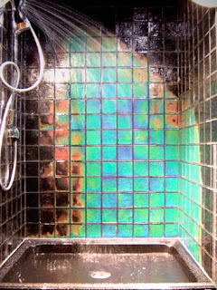
Thermochromic materials would be realy exciting to work with, its a heat sensative material which can come in paint, paper, ink, dye and other forms and once it is at a certain temperature it changes colour. The viewer could the touch the material with the image on to reveal it with the heat of their hand or a heating device.
i have also thought about painting over wax or scratching it away to see the image or pattern.
Digital textiles
The beginning of my second year and the first project set is about digital textiles. i have never realy used much technology within my work, it is mostly hand made . i am realy interested in producing something that becomes an interactive piece, where the viewer can do something to reveal the work. having this in mind i have decided to study animals and how you can recognise what the animal may be without actually seeing the whole creature, for example the pattern of fur, wings or scales. using digital processes such a photoshop i am hoping to use my drawing to make a few designs which i will then take through into more practical textiles such a screen printing or possible using the laser cutter or CAD embroidery machine to further my development onto making a finished piece which the viewer could then interact with by doing something which i will develop over the time of this project to reveal the part of the animal.
Monday, 26 July 2010
i made a cast of my friends face and then filled it with clay to make a mask of her face. as i have been experimenting with silicone for the human anatomy project i made a sample by covering the clay mold with silicone and pealing it off once dry to create a silicone mask covered in veins and nerves...this is just an example to show how i would use the samples i have made in context.
Subscribe to:
Posts (Atom)