
Monday, 15 November 2010
Final Boards.
Here are my final sample boars i got the prints digitally printed and am realy happy with them, i can visualize them being made into fashion prints.


I have decided against using the thermo chromic print on top of my designs simply because it is too weak and i think the designs are strong enough to work on their own. Im not losing anything by not using it as the concept of taking the animal print and turning into a pattern still applies. It is a shame im not using the thermo chromic print but maybe if i had more money and time i would research a lot more with it and other material that are similar.
Friday, 12 November 2010
THERMOCHROMIC EXPERIMENTS
See the blue pattern fade from heat blown onto it.


i also have a few videos but they take ages to upload so will do that another time!


i also have a few videos but they take ages to upload so will do that another time!
Wednesday, 10 November 2010
PRINTS TO FIT THE BODY
I've used a basic mannequin template to put my designs onto so i can begin to visualize what they will look like. As my designs are quite loud and complex i think they are the kind of patterns that should be tailored to fit the garments.

Then i tried using the whole body to display the design, this makes it seem like the mannequin is part of the design, which i think is a better way to show it in context as it has a bigger impact than a dress.

I asked Illustrator Henry Boon http://henryboon1.blogspot.com/ (check out his blog) to draw me some simple model figures as the one i had been using was from the internet. He came up with these....
 ....i think they are wiked and emphasize the shapes of the body, compared to a stick thin perfect model...there's nothing wrong with imperfection!


These look good with the sketchy and jagged outline.....
 ...But these look better! I think the body shape of this is a lot more interesting and different. Plus it kind of looks like a hybrid human/creature, as no human body looks like this!
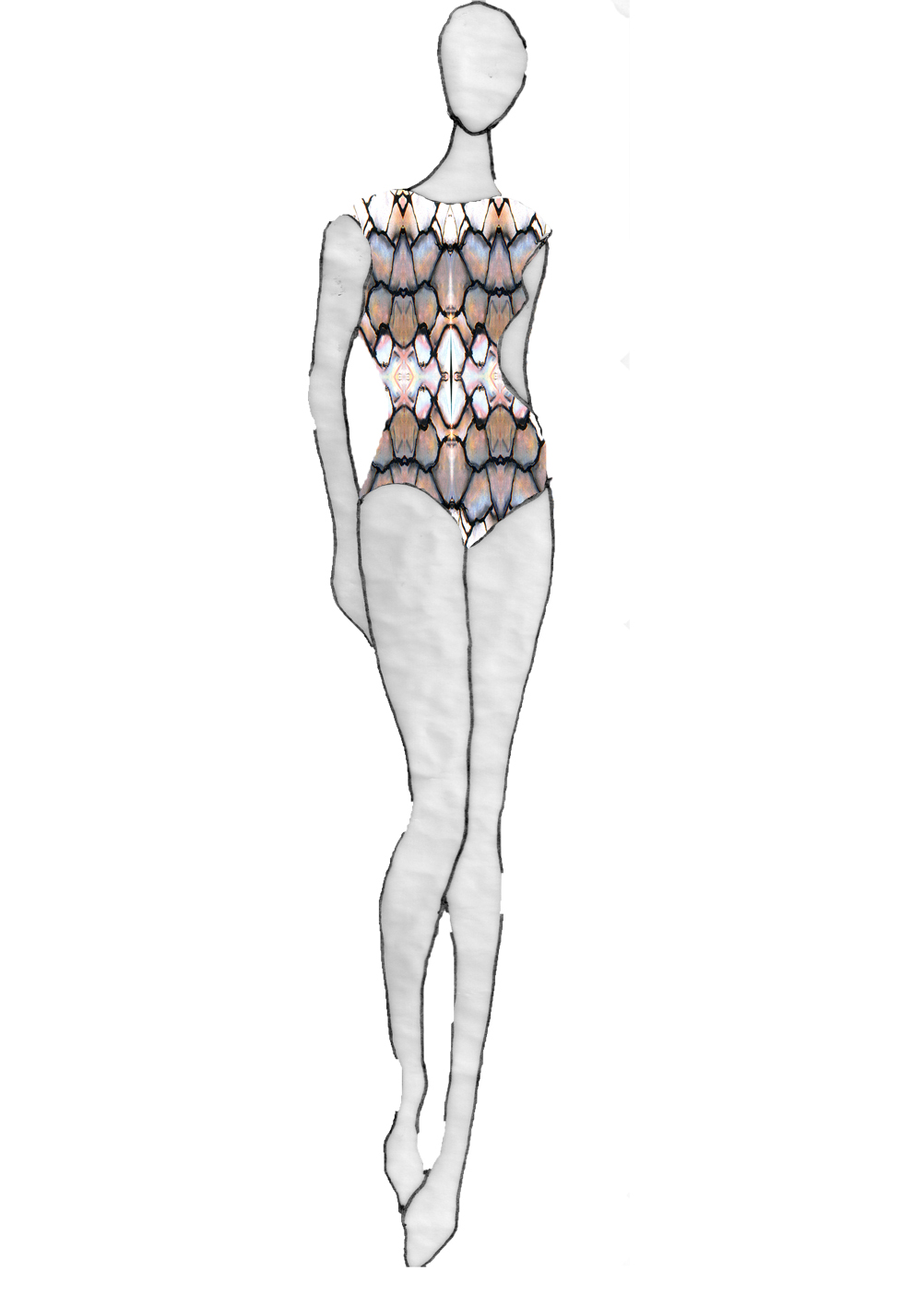
Then i tried using the whole body to display the design, this makes it seem like the mannequin is part of the design, which i think is a better way to show it in context as it has a bigger impact than a dress.

I asked Illustrator Henry Boon http://henryboon1.blogspot.com/ (check out his blog) to draw me some simple model figures as the one i had been using was from the internet. He came up with these....
 ....i think they are wiked and emphasize the shapes of the body, compared to a stick thin perfect model...there's nothing wrong with imperfection!

These look good with the sketchy and jagged outline.....
 ...But these look better! I think the body shape of this is a lot more interesting and different. Plus it kind of looks like a hybrid human/creature, as no human body looks like this!
Tuesday, 9 November 2010
PHOTOSHOP
Before this project i hardly new how to use photoshop, but now i have learnt the basics it has become so much easier to me, and can completely understand why people use it, as to of done all of this buy had would of taken a lot more time!
The blue and the orange are representing the Thermochromic parts of the print which would then fade in the heat and reveal the patterns underneath.


Cutting and Layering.


Repeats


These images bellow are made from sections of the photocopied images, made into a kind of digital collage.


The blue and the orange are representing the Thermochromic parts of the print which would then fade in the heat and reveal the patterns underneath.


Cutting and Layering.


Repeats


These images bellow are made from sections of the photocopied images, made into a kind of digital collage.


Friday, 5 November 2010
PHOTOCOPYING
These are images of my drawings that have been manipulated by dragging them across the photocopier to create distorted patterns.


Sunday, 24 October 2010
Sketchbook
i have done these by painting half of the page and folding it over to create a symmetrical print.


HORNEYYYY


PEACOCK


FISHHHHIES


HORNEYYYY


PEACOCK


FISHHHHIES


Subscribe to:
Posts (Atom)
